
The new core Navigation module (the vertical sidebar that replaces the old horizontal toolbar) displays an icon in front of each top-level entry.
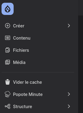
For core entries, everything is taken care of. But as soon as a custom module adds its own top-level link (a "business" section, a "Clear cache" shortcut...), the sidebar falls back to a stopgap: the first two letters of the title in a square. It works, but it's not very pretty.
Let's see how to get custom menu items with their own icons:
How does it work in core?
When building the sidebar tree, NavigationMenuLinkTree creates an icon render array with default values for each top-level link, then merges the link's icon option on top of it if there is one:
// web/core/modules/navigation/src/Menu/NavigationMenuLinkTree.php (simplified excerpt)
$icon_defaults = [
  'pack_id' => 'navigation',
  'icon_id' => $plugin_class,
  'settings' => [
    'class' => 'toolbar-button__icon',
    'size' => 20,
  ],
];
$icon = NestedArray::mergeDeep($icon_defaults, $url->getOption('icon') ?? []);
Three things to take away from these few lines:
- by default, the icon is looked up in the core
navigationpack, with an identifier derived from the link's plugin id. That's how core entries get their icons... and why ours don't: no SVG in the core pack is named after our link, hence the fallback to initials; - a menu link can provide its own definition via
$url->getOption('icon'): pack, icon, and even settings; - core passes two settings to the pack: a CSS class (
toolbar-button__icon) and a size (20). We'll come back to this.
Declaring the icon on the menu link
A menu link's "options" are declared directly in the module's *.links.menu.yml. So all you need is an options.icon key pointing to any installed icon pack, whether it's the project's own pack or a third-party library:
# mon_module.links.menu.yml
mon_module.admin:
  title: 'Popote Minute'
  route_name: mon_module.admin
  parent: system.admin
  weight: -15
  options:
    icon:
      pack_id: mon_pack
      icon_id: toque

mon_module.flush_caches:
  title: 'Vider le cache'
  route_name: mon_module.flush_caches
  parent: system.admin
  weight: -16
  options:
    icon:
      pack_id: iconoir
      icon_id: trash
Here the chef's hat comes from the project's custom pack and the trash can from the Iconoir library. Creating these packs (*.icons.yml file, normalizing SVGs to currentColor, settings...) is covered in detail in the previous article on the Icon API and UI Icons; this one is its direct follow-up.
One drush cr later (menu link definitions are cached, like everything else), the icons show up in the sidebar.
The pack's class setting
A small detail that matters: core passes settings: ['class' => 'toolbar-button__icon', 'size' => 20] to the pack. This class handles the icon's sizing and alignment inside the sidebar button. If the pack's template ignores it, the icon breaks out of the layout.
A custom pack must therefore declare a class setting and apply it to the SVG root element:
  settings:
    class:
      title: 'Class'
      description: 'Classes CSS supplémentaires, transmises notamment par le module Navigation.'
      type: 'string'
And in the pack's template:
.addClass('icon', 'icon--' ~ icon_id|clean_class, class|default(''))To sum up, here is my complete mon_theme.icons.yaml file:
mon_pack:
  enabled: true
  label: 'Popote Icons'
  description: 'Icônes SVG du projet Popote Minute.'
  version: '1.0.0'
  license:
    name: 'Proprietary'
    url: 'https://popote-minute.fr'
    gpl-compatible: false
  extractor: svg
  config:
    sources:
      - icons/*.svg
  settings:
    size:
      title: 'Size'
      description: "Largeur et hauteur en pixels. Sans valeur, le CSS du contexte décide."
      type: 'integer'
    color:
      title: 'Color'
      description: "Couleur de l'icône (remplissage ou trait selon l'icône). Défaut : couleur du texte."
      type: 'string'
      format: 'color'
    stroke:
      title: 'Stroke width'
      description: "Épaisseur du trait des icônes filaires (arrow, chevron…)."
      type: 'number'
      default: 2
      minimum: 1
      maximum: 3
      multipleOf: 0.1
    class:
      title: 'Class'
      description: "Classe(s) CSS ajoutée(s) au SVG — le core Navigation s'en sert (toolbar-button__icon)."
      type: 'string'
  template: >-
    {% if color %}<span style="color: {{ color }};">{% endif %}
    <svg{{
      attributes
        .setAttribute('xmlns', 'http://www.w3.org/2000/svg')
        .setAttribute('viewBox', attributes.viewBox|default('0 0 24 24'))
        .setAttribute('stroke-width', stroke|default(2))
        .setAttribute('aria-hidden', 'true')
        .setAttribute('focusable', 'false')
        .addClass('icon', 'icon--' ~ icon_id|clean_class, class|default(''))
    }}{% if size %} width="{{ size }}" height="{{ size }}"{% endif %}>{{ content }}</svg>
    {% if color %}</span>{% endif %}
iconoir:
  enabled: true
  label: "Iconoir"
  description: "Iconoir is an open-source library with 1500+ unique SVG icons, designed on a 24x24 pixels grid."
  links:
    - https://github.com/iconoir-icons/iconoir
  version: 7.11.0
  license:
    name: MIT
    url: https://github.com/iconoir-icons/iconoir/blob/main/LICENSE
    gpl-compatible: true
  extractor: svg
  config:
    sources:
      - /libraries/node_modules/iconoir/icons/{group}/{icon_id}.svg
  settings:
    size:
      title: "Size"
      type: "integer"
      default: 32
    color:
      title: "Color"
      type: "string"
      format: "color"
    stroke:
      title: "Stroke width"
      type: "number"
      default: 1.5
      minimum: 1.0
      maximum: 2.0
      multipleOf: 0.1
    class:
      title: "Class"
      description: "Classe(s) CSS ajoutée(s) au SVG — le core Navigation s'en sert (toolbar-button__icon)."
      type: "string"
  template: >-
    {% if color is defined %}
    <span style="color: {{ color }};">
    {% endif %}
    <svg xmlns="http://www.w3.org/2000/svg"{{
        attributes
          .setAttribute('viewBox', attributes.viewBox|default('0 0 24 24'))
          .setAttribute('width', size|default('32'))
          .setAttribute('height', size|default('32'))
          .setAttribute('fill', 'none')
          .setAttribute('stroke-width', stroke|default('1.5'))
          .setAttribute('aria-hidden', 'true')
          .addClass('icon', class|default(''))
    }}>
      {{ content }}
    </svg>
    {% if color is defined %}
    </span>
    {% endif %}
The size setting is passed along too: if the pack declares it (as the examples in the previous article do), the icon gets its 20-pixel width/height with nothing more to do.

Written by Kevin Gautreau — freelance PHP/Drupal developer & trainer in Auvergne, France. get in touch
Comments (0)